Introduction
In exploring the world of daily commutes, I undertook the task of evaluating the user experience (UX) strengths and weaknesses of the Nexus Metro App. I employed a heuristic evaluation, a valuable method for analyzing user interface (UI) designs against established usability principles. My objective was straightforward: to identify areas where the app could improve, ultimately enhancing user satisfaction and effectiveness.
View full design on Figma : POP Nexus App Heuristics - Madhura
Evaluation
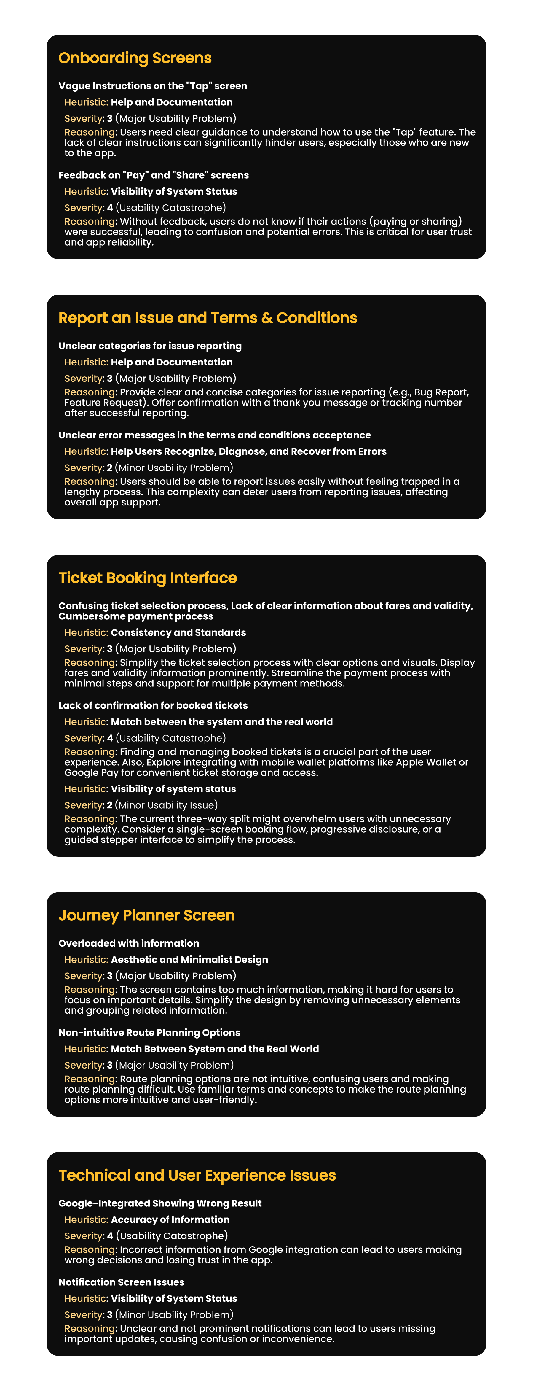
Based the evaluation on Jakob Nielsen's 10 Usability Heuristics for User Interface Design, which are widely recognized principles for evaluating the usability of interfaces. I identified key screens and interactions within the Nexus Metro App that are critical to the user experience. This included onboarding screens, issue reporting, ticket booking, journey planning, and real-time updates.
For each identified issue, I suggested potential improvements and solutions aimed at enhancing usability and user satisfaction and have documented all findings in a detailed report, including screenshots, identified issues, severity ratings, and proposed solutions.


Detailed Heuristic Analysis with Severity Ratings
Reflections
Through this heuristic evaluation, several critical usability gaps and friction points were identified across the interface. These insights not only highlight areas where the design deviates from established usability principles but also provide clear, actionable recommendations to improve user satisfaction, task efficiency, and overall experience. Addressing these issues will contribute to a more intuitive, accessible, and user-centered product. For a more comprehensive breakdown of this heuristic evaluation, including additional insights and details, please read the full version on Medium** 🙂 **