Technical Challenge: Design and develop a developer's blog page
Task Overview
The project involved redesigning and developing a Developer's Blog Page for Ryalto. My goal was to create a user-friendly interface where team members could share knowledge and insights on new technologies or frameworks. I focused on aligning the design with Ryalto's brand values while enhancing user engagement. The process included creating mockups in Figma, followed by development using static HTML and CSS to ensure clean, semantic code and maintainable styling. My submission included the design, the static webpage, and a detailed explanation of my design decisions. I emphasized the rationale behind the layout, color scheme, typography, and features specifically chosen to improve the user experience and content discoverability and also the kind response from the team.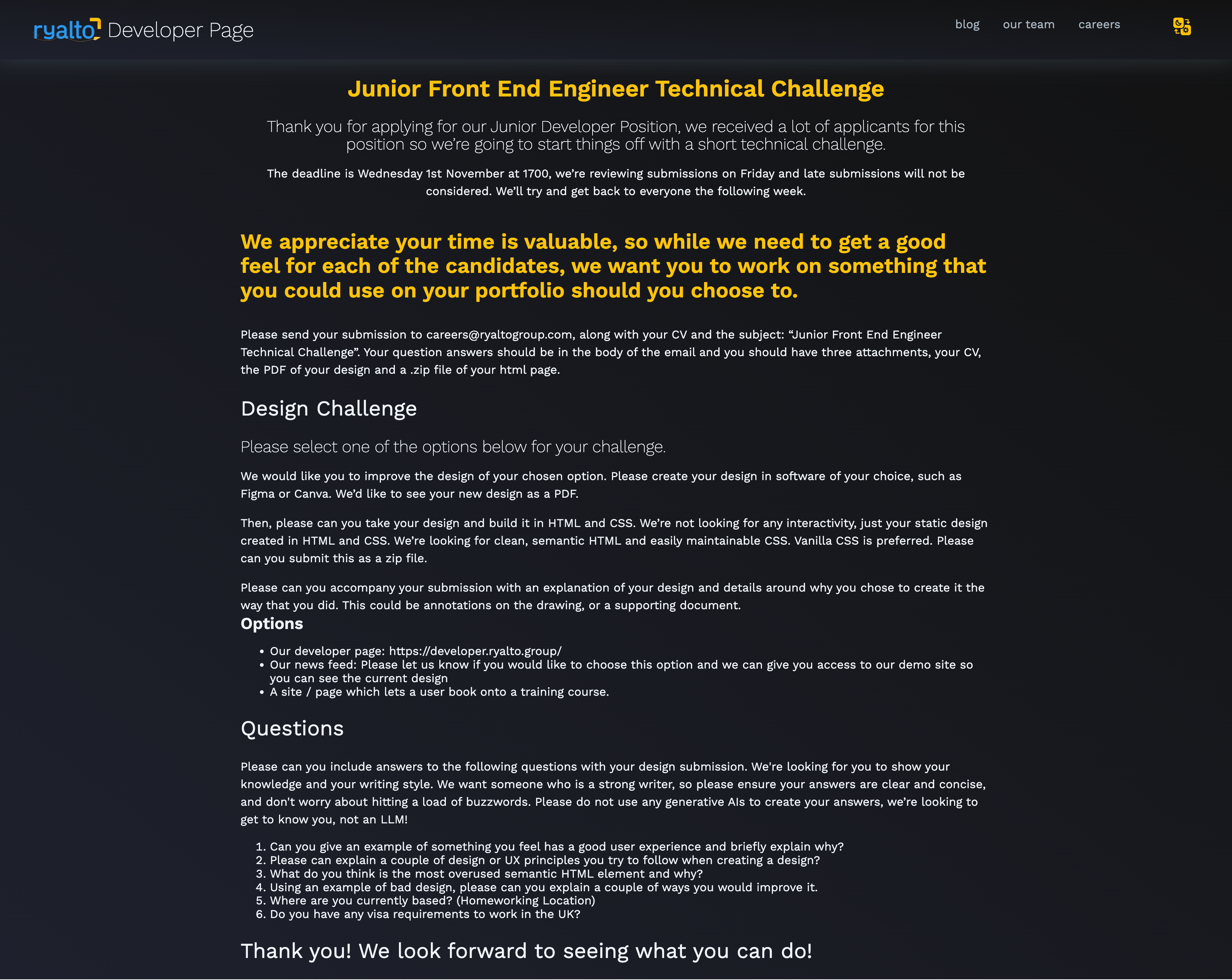
Understanding the challenge
The main challenge was to design a page that was not only full of useful developer information but also kept users interested. I needed to find the right balance between looking good and being useful. It was important to know who the users would be and what would make the page useful and interesting to them. I also had to organize a lot of information in a way that was easy for users to navigate, also included organizing a vast amount of content in a way that is easily navigable and appealing to the target audience.
Research and Analysis
To tackle this, I started by studying the target audience, which included developers, tech enthusiasts, and potential new hires. I looked at what similar websites were doing through surveys, and other similar web pages to understand what users liked and didn't like. I also checked out our competitors to learn from their designs.
About the Design Principles
I used basic but important design principles like focusing on the user, making sure everything was clear and consistent, intuitive navigation and organizing information well. I wanted to make sure users could find what they were looking for easily and that the site was engaging, using good design elements like color and typography to match Ryalto’s style.
Specific Design Choices
Made specific choices like creating a navigation bar with sections such as "About" and "Dev Essentials" to help users find information quickly. I also added a blog section and career opportunities to give a full picture of what it's like to be a developer at Ryalto. I chose elements that would make the page more interactive and engaging. Below is an annoted design file for better understanding:
Outcome and Reflection
This project helped refine my design instincts and problem-solving skills through iterative improvements in navigation, layout, and interactivity, enhancing user-friendliness. It was an independent assessment without Ryalto staff involvement. The platform effectively showcases Ryalto developers' projects, promoting knowledge sharing. I was validated by placing in the top 10% of Ryalto's Junior Front End Engineer Technical Challenge, which encourages me as I pursue my next design role.
** 🙂 **
Project information
- Project Duration:2 Days
- Domain: Web Design and Development
- Design Tools: Pencil Sketch (Low fidelity), Figma, Procreate
- Dev Tools/Technologies: HTML,CSS, Visual Studio