In my previous role, I worked on an ERP platform designed to facilitate business operations by integrating multiple functions into a single, user-friendly system. My focus was on key UX foundations, including user onboarding, global search logic, and design system components, as well as defining logic-heavy flows, designing wireframes for cross-functional alignment, and building scalable patterns that balanced user needs with technical constraints.
Redesigning Global Search for a Scalable ERP System
Please access this link to review the complete task and user flows on Figma - Open in Figma
Project Context
Search in enterprise systems is rarely straightforward. Many studies show that while thousands of queries are made each month, most are low-frequency and unpredictable, creating a long tail that systems struggle to handle. Combined with hidden filters and complex logic, this often leaves users without clarity. Research on Queries in Authentic Work Tasks (Emerald, 2021) shows that search behavior is strongly influenced by task type and complexity.

"To put it simply, search ends up feeling confusing, and users often don’t get the answers they’re looking for. The research highlights that while thousands of queries are made each month, most are unpredictable and low-frequency, and when combined with hidden filters and complex logic, this often leaves users without clarity."
So, this project focused on redesigning the global search experience within a complex ERP environment. The aim was to let users quickly find tasks, projects, and other entities without jumping across modules. I defined more intuitive search behaviors, managed vague or partial queries, and made results clearer. The previous system was functional but required users to remember intricate processes through an unclear interface. My redesign simplified this by surfacing query logic, showing live feedback, and providing actions like saving and exporting, creating a transparent and scalable search experience.
Problems with the Existing Search
The global search experience within the ERP platform had several usability shortcomings that impacted efficiency and user confidence. While it supported powerful queries, the interface didn’t communicate logic clearly or guide users effectively. My goal during the redesign was to make complex data accessible through intuitive filtering, consistent hierarchy, and reusable patterns. Key issues included:
No Clarity in Logic
- AND/OR nesting was unclear
- Filters looked flat and ambiguous
- Small changes caused unexpected behavior
No Visual Grouping
- No clear hierarchy or structure
- Lack of validation or preview
Hidden Complexity
- Advanced filters buried under layers
- Nesting was available but invisible
Lack of Reusability
- Couldn’t save or reuse queries
- Frequent repetition for common tasks
Insights from Other Platforms
I explored how platforms like Monday.com, clickup, Jira, Notion, and ProjectManager solve logic-heavy search.
- Field → Operator → Value structure: Used widely in Jira to ensure query consistency.
- Grouped logic: Notion and Airtable apply collapsible conditions with AND/OR toggle.
- Progressive disclosure: Google hides complexity unless needed.
These insights helped shape the structure, layout, and feedback mechanisms.
Design Approach - Building Around the Logic
Before jumping to UI, I started with how users phrase queries. The foundation was built on predictable steps:
1. Identifying Query Patterns
Many queries resembled: "Tasks assigned to me AND due this week OR marked urgent." This required visible groupings and consistent order.
2. Defining Interaction Steps

- Start with a search intent
- Select item type (e.g., task, file, message)
- Follow a consistent format: Attribute → Operator → Value
- Allow grouped logic using AND/OR with visual clarity
- Provide real-time result previews to reduce uncertainty
Designing the Solution
Clear patterns and behaviors made the system feel structured yet flexible.
1. Modular Filter Rows
- Attribute: e.g., Task Status
- Operator: equals, contains, etc.
- Value: e.g., "In Progress"
2. Visual Grouping
Grouped conditions were color-coded and indented, ANDs stacked, ORs separated.
3. Real-Time Feedback
As users built filters, a preview showed real-time results, boosting confidence and reducing trial and error.
4. Saved Queries
Users could save and reuse queries. Great for recurring reports and team consistency.
Design Highlights from Final UI
What stood out in the final product:
- Standardized Format: Filters follow
Attribute → Operator → Valueconsistently. - Color-Coded Logic: Visual distinction for AND/OR using color and layout.
- Nested Grouping: Collapsible logic blocks help manage complexity.
- Progressive Filtering: Simple view by default, detailed logic shown as needed.
- Quick Edit Tools: Easy to adjust or remove filters.
- Live Preview + Save: Results updated instantly; common queries can be stored.


Why This Design Worked
This wasn’t about hiding complexity, it was about organizing it. The logic matched user's mental models.
- Structured logic: Clear paths for building and editing filters.
- Visual feedback: Users could predict how logic behaved.
- Scalable foundation: New modules or fields didn’t disrupt usability.
- Usable by all: Beginners and power users shared the same system, guided but flexible.
Reflections
I changed my approach from focusing on user interfaces to embracing systems thinking. Besides designing functional layouts, I sought to grasp how individuals build trust and evaluate reasoning, Through this, I
- Learned to structure abstract logic into simple modules.
- Designed not just for interaction, but understanding.
- Gained confidence in tackling layered workflows.
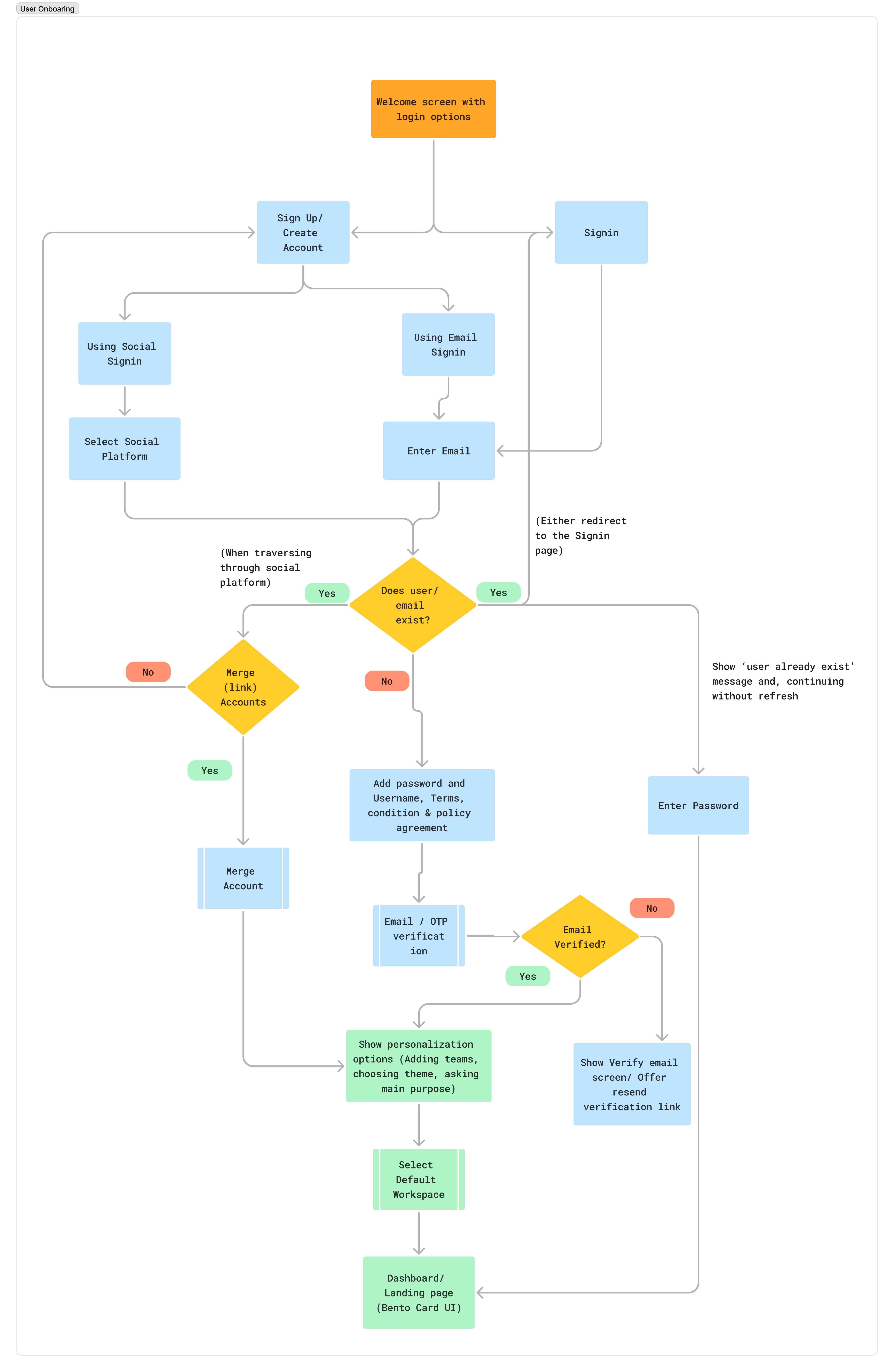
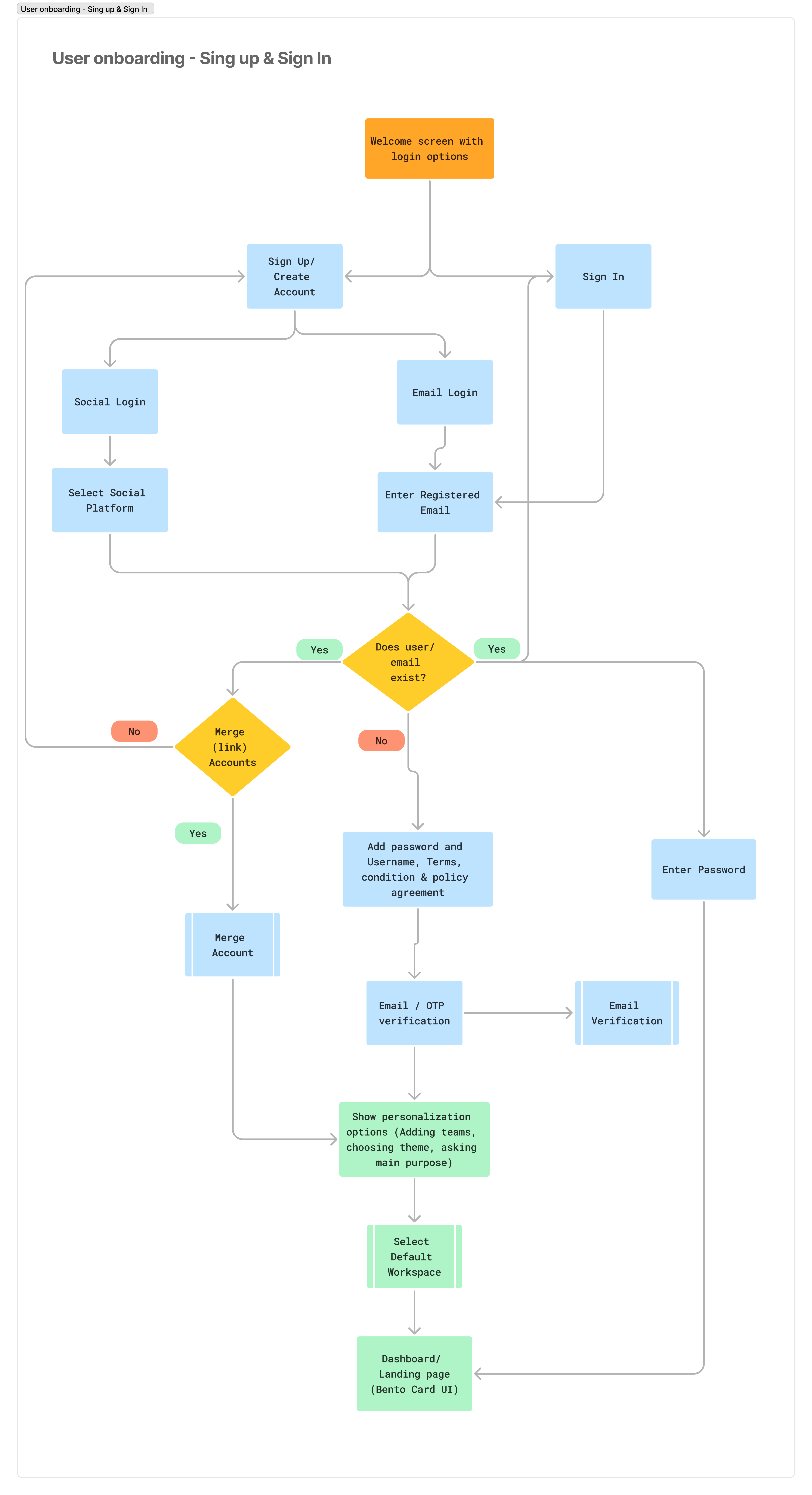
User Onboarding Flows – Signup & Login Logic
Please access this link to review the complete task and user flows on Figma - Open in Figma
I designed the onboarding logic for both new and returning users, covering signup, login, and workspace access. The goal was to ensure users could enter the product environment with clarity, whether they arrived via email, social login, or invite links.
This process included:
- Mapping the entire onboarding flows, which encompass user account creation, joining an existing workspace, and validation processes during the initial login.
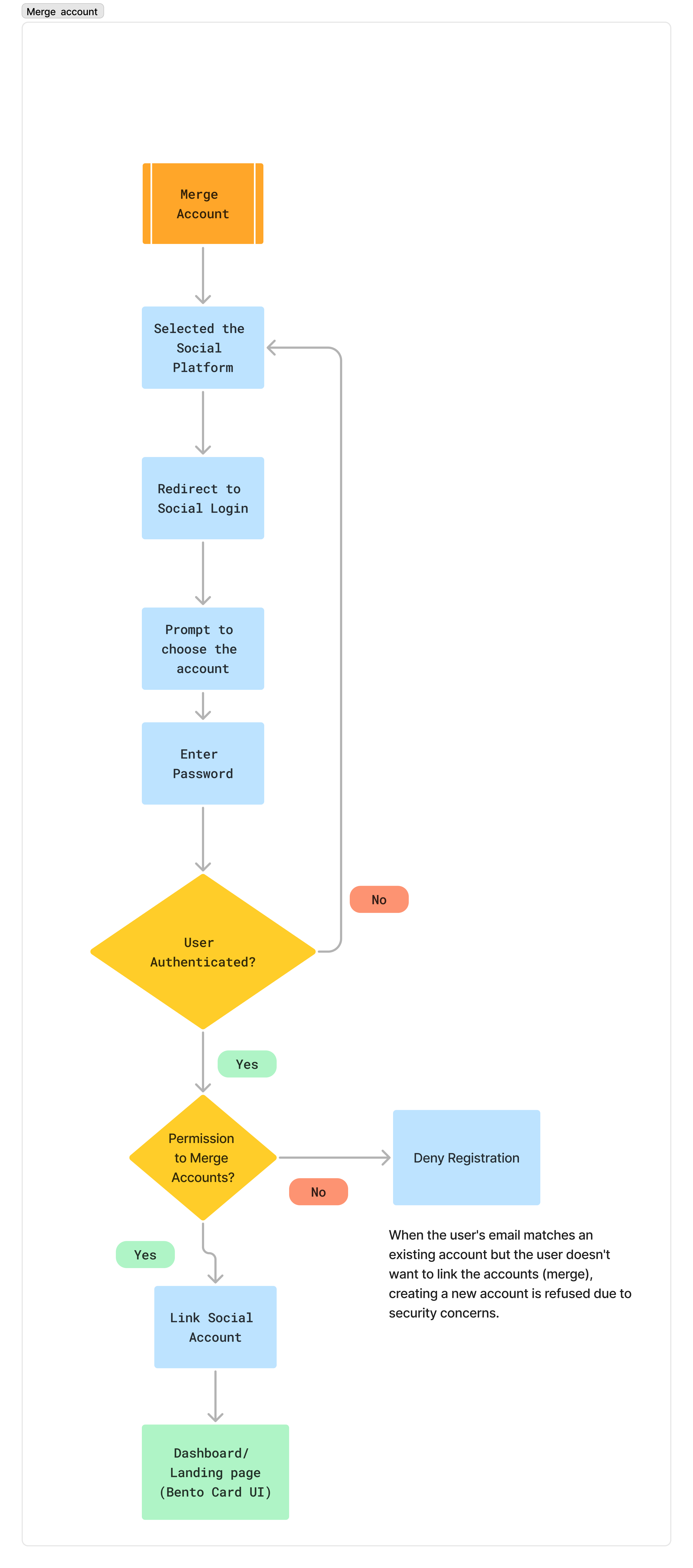
- Merging accounts for users who try to log in using different methods, such as social media or email, by identifying potential redundancies and prompting them to merge their accounts.
- Structuring tasks to align with the folder hierarchy utilized in ERP and task management applications.
- Converting these processes into low-fidelity wireframes that illustrate the core onboarding logic, potential edge cases, and necessary error handling.
The outputs facilitated alignment among the product, engineering, and QA teams regarding the functional requirements and flow logic of the onboarding process.
Visuals and Flow
Design Decisions
I designed a straightforward sign-in and sign-up flow that emphasizes user validation and account merging for social logins. The process begins with a simple registration form that includes necessary fields while ensuring real-time validation to guide users as they enter their information.
For returning users, the sign-in page provides easy access options, including social login buttons. When users log in with a social account, the system checks for any existing accounts associated with the same email address and prompts them to merge their accounts if a match is found. This merging process is seamless and ensures that users retain their existing data and preferences without any disruption.
Additionally, I incorporated clear messaging throughout the process, including success and error notifications, to keep users informed and reduce any potential confusion. The entire flow is designed with a focus on user experience, making transitions smooth while maintaining the functionality needed for various entry methods, including direct invites or links. Overall, the approach aims to enhance accessibility and continuity across sessions and devices.
Reflection
Signup and login flows are some of the most universally adopted patterns in digital products. The underlying logic, managing authentication, user sessions, and account states, is mature and rarely requires reinvention. The value lies in clearly mapping these flows for different user states (new, returning, invited), resolving edge cases like auth-provider conflicts, and aligning cross-functional teams on entry-point behavior. This ensures a seamless user experience without compromising on technical consistency or product scalability.
Designing Custom Task Views and Type Logic for ERP Applications
Explore detailed views and research notes here – Open in Figma
Project Context
This project aimed to enable teams to create flexible task types and reusable views within an ERP-based task management system. As the variety of tasks increased encompassing bugs, issues, features, and subtasks the platform required a scalable and intuitive system to support custom workflows. My role involved designing the processes for creating, switching, and converting task types to ensure consistency across entities and prevent data loss. I also structured how views, such as task lists and details, could be customized and reused across different teams.


Research and Insights
I mapped workflows across platforms like Jira, ClickUp, and Asana to understand how teams manage diverse task types. One consistent pattern was the need for field compatibility and task type switching, especially when converting a task to a sub-task (or vice versa). Another insight was how users preferred to build views incrementally, starting with only necessary fields and evolving them as projects matured.
Admins needed control over shared structures, while individuals required flexibility without breaking consistency. I created a framework where task types were modular, view definitions could be reused or duplicated, and edge cases (like unsupported fields or view mismatches) were clearly communicated through prompts and validation.

Design Decisions
My focus was to design logic patterns that supported customization while keeping defaults stable. Default types like “Task” and “Sub-task” remained globally available, while users could create new ones per project with descriptions, custom fields, and reusable view templates.
- Allow project admins to define task types with name, description, and field sets
- Support converting tasks between types with clear prompts on what changes or breaks
- Prevent data loss when switching types by checking field compatibility
- Enable teams to duplicate existing views and customize them instead of starting from scratch
Key Considerations
- Handling conversion from task to sub-task while preserving essential fields
- Warning users when parent-child linking causes field mismatches
- Maintaining system-wide defaults regardless of custom types
- Helping users visualize view-level differences during duplication or switch
Task Views and Flow States
Each task type could include one or more views, depending on how the user planned to use or visualize the task set. These views supported different goals — tracking, planning, or reviewing.
- List View: Focused on inline edits and fast scanning of task attributes
- Calendar View: Allowed date-driven sorting and visual scheduling
- Task Detail View: Provided full access to comments, history, and sub-items
- Dashboard View: Summarized data by type, status, or assigned user
Why This Direction Was Promising
Although the implementation wasn’t fully completed, the design direction provided a scalable structure for task customization. It balanced flexibility with clarity — allowing teams to grow their workflows without losing consistency. Early feedback from internal discussions showed promise for its adaptability across modules.
- Enabled custom task types while maintaining system-defined stability (e.g., Task, Subtask)
- Linked views to task types so users could build context-specific experiences
- Built safeguards for conversion (e.g., warning users about field compatibility or data loss)
- Allowed users to duplicate or build views from scratch to suit different team structures
Reflections
This project provided valuable insights into designing scalable task systems. It enhanced my ability to think in terms of logical structures rather than solely focusing on screen flows. As a result, task types, field behaviors, and UI feedback became more cohesive. This experience reinforced the idea that good design is not only about interaction but also about how systems function in complex scenarios.
- Learned to model task logic that supports both structure and customization
- Balanced technical feasibility with UX clarity when handling edge cases
- Explored how permission levels, defaults, and flexibility coexist